Period 1
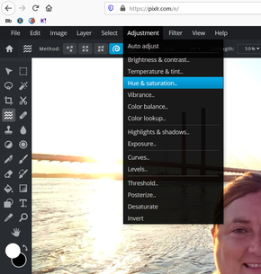
Hello everyone. Hope your Thursday is off to a great start. We're cruising along here in Photography! We've learned a lot already about editing, taking pictures and general computer knowledge. We haven't learned as much as we would have if we were meeting face to face and had 80 minutes a day together but we're doing well! Today I would like to revisit the idea of making a selection. When we started the course, and were working on the merging project, we learned to make a selection of you. We even did a practice item. Well, that's not the only reason to make a selection. There are many in fact. One would be our next assignment... Color for Emphasis. Clicking on that link and entering the password monochrome will take you to an explanation of the assignment and also show you a few examples. I had assigned photos with a splash of color as an assignment awhile back. My hope is that one of those photos could work for this assignment. Of course you can use any school appropriate photo that you have ever taken for this assignment if you would rather. The goal is to use color on just part of the photo to make the subject stand out. On the page linked above you'll also find a link to a handout that explains how to do the project. There is one issue though... Hue & Saturation is found under the Adjustments menu in Pixlr. The handout says it's under the Image menu but since we're in Pixlr, just open the Adjustments menu and you'll find it there. You can also see it in the photo at the right. Take your time with the selection though... a bad selection means a jenky looking project! I'm giving you extra time to get a good selection and make a nice looking project. This isn't due until Monday. If you have any questions about it, just let me know! Have a great day!
Period 4
Good afternoon camera geeks. Hope you're having a good day today. The last few days we experimented with levels. It's a really powerful tool that I love to use! I hope you can see the beauty of it too. Today though we are going to learn about a similar tool that some photographers like more than levels. That is Curves. It is similarly built around the histogram, and yields similar results, but is used really differently. This will walk you through it. You will need this photo to use for this project. Please walk through this lesson using these files. When you are done, just upload your after file to Schoology. That's all for today, hope the rest of your day goes great!
Period 5
Hello there everyone. Today, as we continue to with our exploration of type, I have a different kind of project for you to do. I have a list of words here. I would like you to choose on of the words from the list. Just pout you name next to that word and everyone will know that it's taken. Then I would like you to take a stab at personifying that word. Huh? I want you to make the word look or feel like what it represents. This is a little abstract, but I think it should be fun! You may use any typaface you want (except webdings or other fonts that are composed only of glyphs) to type your word. The you can change tracking, placement, rotation of letters, colors, you can even use the pen tool to add a simple effect to it... say a tail, top hat, etc. If you want to rotate or position letters separately you may need to type each one individually.
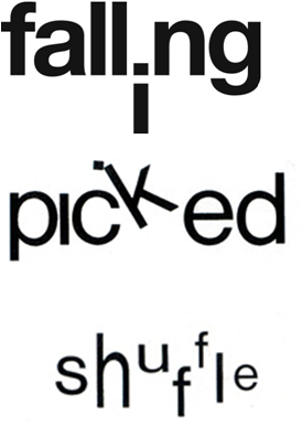 | I would start by brainstorming a list of things that represent that word... similar to what I did for the music genre. Then you could make some thumbnails. The process should be familiar to you by now! Since this is a little more abstract and requires more planning and thought I'm giving you more than just a day to do this. I would like you to upload 4 thumbnails by the end of the day tomorrow, but the project as a Gravit file isn't due until the end of the day Monday. That's all for today, make it another great one! |
 RSS Feed
